 Loading... Please wait...
 Keywords
Welcome to use PayPal
Categories
New Products
-
HKD0.00
-
HKD0.00
-
HKD0.00
-
HKD799.00
-
HKD6,200.00
- Home
- Pantone Products
- Trend Forecasts
- Products(Order Hotline:852-28877202)
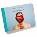
- PANTONEVIEW Colour Planner Spring/Summer 2015
Product Description
Speed
Get a glimpse into Speed: Download more information.
When an object is moving at speed, it creates energy and appears to connect with others. As we slowly transition away from nostalgia into a realm of vintage and modern, slow and fast, we begin to mix our different speeds in our products and designs. Shades blur and merge, colors are rather mid-toned; they are more intimate, personal and quieter; they do not shout, they talk. Bright’s, less obvious then before, are more user- friendly. There is a balance between classic and more unusual colors, a balance between subtly nuanced shades and bright “full stops,” all the while the effect of light influences and energizes our color stories and animates material surfaces.
PANTONEVIEW Colour Planner Spring/Summer 2015 includes:
‧Seasonal inspiration, key color directives and suggested color harmonies for men’s, women’s active, cosmetics, interiors, industrial and graphic design.
‧1” x 4” removable cotton swatch strips of each of the forecasted colors
‧Corresponding printed version of the forecast colors in perforated chip format.
‧Portable color card grouping colors by family each displayed in 1” x 2” cotton chip format
‧DVD containing still images of photos and a movie with music to illustrate the mood of individual trend palettes
‧Poster highlighting the seasonal overview
Find Similar Products by Category
Customers Who Viewed This Product Also Viewed
-
HKD0.00
-
HKD0.00
-
HKD0.00
-
HKD1,200.00HKD1,080.00


